As someone who enjoys both web development and Vaporwave, I can't get enough of this
As someone who enjoys both web development and Vaporwave, I can't get enough of this
Thanks a lot! I wanted to buy some retro design shirt and web dev shirt one night, and decided to mix it into a single design and make my own instead.
One of our local artists sent a similar tweet in the past:
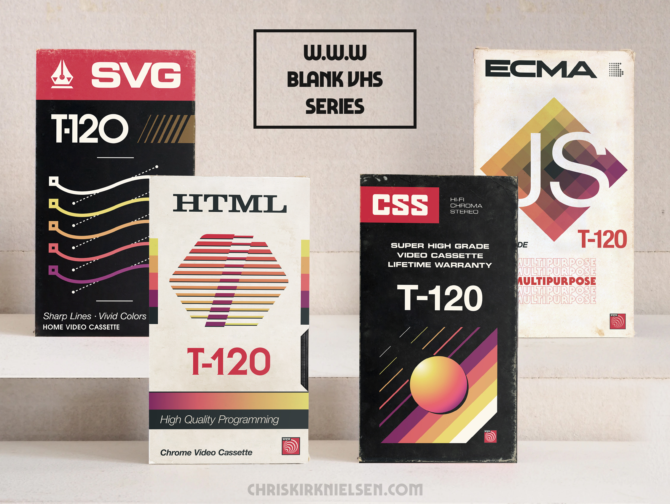
I wondered whether there's a more flexed version of arm emoji. Then I remembered that I draw cartoons already. :D
Your design is great, BTW. Also, why there's no wallpapers for this?
Haha, that's pretty cool! I can't draw, only line up shapes on a computer!
Wallpaper? I quickly slapped this together if that works: https://imgur.com/a/OLaDGjJ
Wallpaper? I quickly slapped this together if that works: https://imgur.com/a/OLaDGjJ
Of course! That's very kind of you, thanks!
Haha, that's pretty cool! I can't draw, only line up shapes on a computer!
Then may be you can start to draw shapes, and move up from there. You're making art at the end. That counts by me.
I can do neither, but take photos. :)
https://lucaspequito.github.io/index.html
still very early, but I think you might like it.
These look really good. You make me want to tape The Ewok Adventure on them.
These are doooooooooooooooooooope
Thank you so much!
I'm going to be that one critical redditor. I do love these- but you designed them with modern aethetics of how space and text should coexist.
In short- they are too balanced to be retro?
There is to much breathing room around the different graffics and text for it to register as vintage.
Something about old print and logos felt a little crowded...
I think that is what's missing.
So- all of them are so crisp. It's a spiritual successor- but doesn't appear retro at all... because it's got to many crisp illustrator edges.
Again- these are great- but they don't invoke a retro vibe for me, they are obviously modern and it shows.
Hey I appreciate the feedback! That makes a lot of sense, and now that you've pointed it out, I can definitely see what you mean.
To be honest, when making these, I was just trying to have fun with it without getting too close to existing designs. I did tinker with the idea of roughing up or slightly blurring the lines themselves but since it's for t-shirt prints, I felt it's be best to let that process smooth it up a bit haha.
I understand what you’re getting at, but these are not obviously modern. I thought this about the “JS” but then I thought actually a font like helvetica has been around forever.
Maaaaybe they could do with a little more narrow, tall tight packed letters, but to counter your opinion, this stuff would have fit in great in the 80s/early 90s.
See actual examples: https://www.google.com/search?q=blank+vhs+box+art&tbm=isch&ved=2ahUKEwjy4oTaw6vyAhXPPt8KHbVEDcQQ2-cCegQIABAC&oq=blank+vhs+box+art&gs_lcp=ChJtb2JpbGUtZ3dzLXdpei1pbWcQAzIFCAAQgAQyBQgAEM0CMgUIABDNAjIFCAAQzQIyBQgAEM0COgQIABBDOgYIABAHEB46BAgAEA06CAgAEA0QBRAeUJX6AljZgANg9IIDaABwAHgAgAGJAYgBhwWSAQM2LjGYAQCgAQHAAQE&sclient=mobile-gws-wiz-img&ei=8xkVYbKdNM_9_Aa1ibWgDA&bih=547&biw=375&client=firefox-b-1-m&prmd=isnv&hl=en
Let me put it another way- they are super close to being there. But the the font spacing and logo placement gives them away. It's on point but just a little too crisp and neat. Look at how uncomfortably close some of the text is in the linked images. There's an odd intensity and sloppiness that is missing in OPS designs.
Hard to put a finger on it because it's subtle. Basically- we can fart around with layout and spacing in modern work - and it was more difficult to achieve the same kerning and spacing back then when things went to print.
Illustratior and such programs make things that look to perfect.
To be clear- I love these designs- but if OP wants a truly retro vibe they might want to unbalance them a bit.
These are gorgeous! And the wear and tear really brings it all together lol
Thank you! I just couldn't leave them in perfect condition haha.
Look like Electronic Gems visuals, noice
these are amazing! super great work!
These are perfect…I love them…If they were for sale I would pick up the whole set just to put them on a shelf…
Thank you! I wish I could print VHS sleeves and sell them but sadly I think that's too niche haha. Got shirts though!
R E W I N D
Now please make video tutorials for each of these languages and distribute them on the VHS tapes.
Oh, all the sweet graphics I could make… now that would be pretty fun!
This is awesome. My spouse and I love collecting VHS tapes and I just got into learning web dev, so this really hits my soft spot. You’re hella talented and I would love to see a similar design on a T-shirt lol.
That's awesome! I'm happy it works as intended haha. I actually have t-shirts for sale via the usual shops, but I wanted to make sure I abided by the "No self-promo" rule. If interested I can DM you the links. Best of luck with your learning journey, I hope you have lots of fun!
Hey these loot great, spot on from what I remember them looking like
Much appreciated, thank you mate!
very cool
Tbh I didn't realise those were not authentic designs until I read the title so safe to say you've done a pretty good job
That's awfully kind of you to say, thank you!
I have a fiend or two who would 100% buy posters of these.
I'd be happy to DM a link to where these can be bought!
Yes, please.
Thanks, that'd be cool
Superb.
I love the second poster to the left, the white one
Putting "multipurpose" on the JS box is genius!
Thanks! I thought it'd be reasonably adequate haha.
I thought these were real for a second.
LOVE!!
i... i fucking love this
Need a tutorial
Jejejeje ecma...
[removed]
Scam Link and or Suspected Bot Activity
They’re great. I recommend changing T - 120 to maybe releases of the langauge. Like html 5 is V - 005, css V-004, css “super high grade cascading style sheets”
005 minutes is too short for recording a CSS tutorial, though.
I love a challenge but yeah, five minutes to teach CSS, I'm out haha.
I was trying to keep these looking as legit as possible if thrown in with real blank VHS designs, but I absolutely was on the fence at one point!
Nice. The only problem is when viewing I immediately think, oh what’s that huge t-120 thing stand for? Oh nothing to actually do with code.
It’s a bit of a large element to just be eye candy
Yeah I see what you mean. Maybe I'll think about some appropriate 4-character sequences instead (JS could have TC-39, for example). I appreciate the feedback!